


Since colors play such an important role in conveying a specific message, it’s vital that you choose the right color scheme for your company website with caution. Choosing a color scheme is an important part of improving the company’s online reputation.
According to a study, up to 80% of buyers think the color is the most significant aspect in determining which product to purchase, and 92 percent believe visual presentation is the most convincing selling factor overall. Colors in social media are no exception. The first and most difficult challenge in getting noticed on social media is to keep the followers from scrolling. I’d like to share a few pointers about how to pick the best color schemes for your infographics, and you’ll find that applying color theory concepts to infographic design isn’t as daunting as you may think.
Why Colors are Important in Social Media Growth?
Social media is a very visual medium. On all platforms, images (and, progressively, video) are the most entertaining material. Photos are critical for catching the interest of the 3.2 billion daily users across all formats. When people are given information along with a picture, they recall 65 percent of it three days later, compared to just 10% when they are given information alone. Posts with pictures on Facebook get 2.3 times the amount of engagement as posts without images.
The first impression is the last impression. This is especially true when it comes to your name since the color of your logo is likely to be the first thing people remember. Colors evoke emotions and thoughts, as well as convey details. Customers will form an initial view of the product without even understanding what it is about. Simply put, brand colors have a significant impact on whether or not consumers choose to participate.
How Colors Affect Audience?
We all know that red denotes threat and green denotes nature, but both colors have additional meanings and associations. The study of how colors influence people’s attitudes and actions is known as color psychology. It enables us to comprehend color and use it to our benefit, especially in marketing and branding.
So, let’s look at how to choose the best color for your brand to be distinctive.
Also Learn This: 10 SOCIAL MEDIA CAMPAIGN IDEAS FOR BLACK FRIDAY SALE
The formula for Building a Brand Color Scheme
- Understand Color Psychology
Color theory has been studied extensively. You might easily get lost in the rabbit hole of discovering the story behind each painting, but here’s a short rundown to get you started:
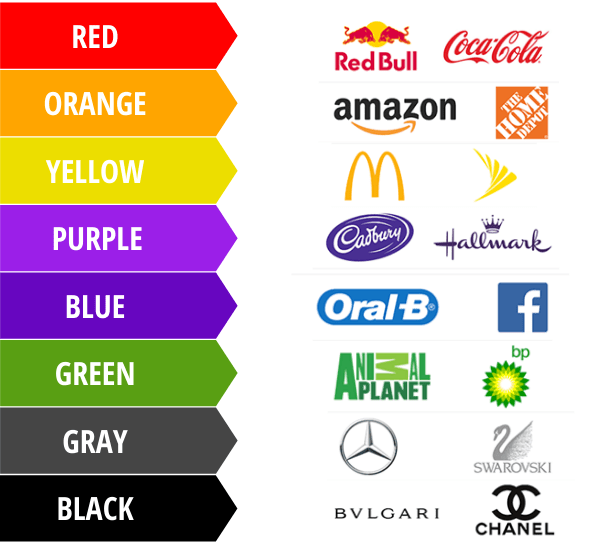
- Red represents risk, suspense, and electricity. It’s also known as the color of passion and devotion.
- Pink is a feminine color that is nostalgic and romantic.
- Orange, like its namesake, is vibrant and full of life. It is also synonymous with being imaginative & adventurous.
- Yellow is a happy color. It’s a color that’s synonymous with being carefree and cheerful.
- Green is a natural color that is often used to highlight sustainability.
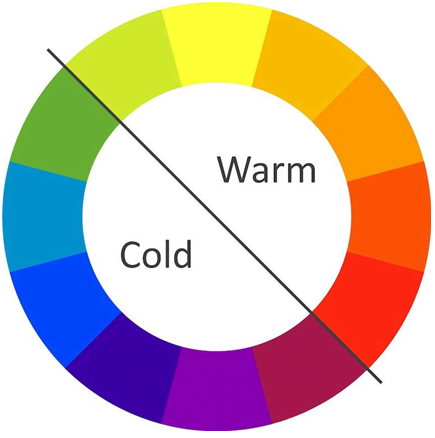
- Blue is dependable and trustworthy. It has a soothing effect or is often associated with depression.
- Purple represents royalty and majesty. It can be spiritual and enigmatic.
- Brown is a straightforward and truthful word that is often used to describe healthy, wholesome goods.
- White is the purest color. It conveys innocence and purity, also with a minimalistic feel.
- Black is a sophisticated and stylish color. It can be formal and luxurious, but it can also be sad.
- Multicolor can be unified or available to everything. It’s excellent at conveying the spirit of diversity.
Types of color
- Color Hues: Variations of the main colors red, yellow, and blue are referred to here. As you can remember, based on how they are combined, these three colors will produce each other color.
- Color Shade: When black is applied to a hue, the amount of shade corresponds to the amount of black that has been added.
- Color Tint: This is the white variant of shade, with white added to lighten the color.
- Color Saturation or tone: This is where you apply both black and white to a pigment to change its look.
In addition, there are a plethora of other colors within this range. Colors such as baby blue and navy also add to the color story.
- Identify Your Brand Accent
After the base color, your accent color will be the which you use the most. This is more complicated than picking your base shade because there are more constraints: in addition to matching a company personality attribute, your accent color must also physically pair with your base shade, not to mention please your viewer.
- Identify Brand’s Personality Traits
Which of your brand’s personality characteristics is the most important? Your base color should not only represent your brand’s most influential characteristic but should also cater to the target demographic you’re attempting to attract. The remaining colors will be chosen depending on how much they complement this one.
- Create Brand Color Palette

Let’s face it, there are several different shades of brown, so let’s take a closer look at the colors, both as an individual brand hue and as part of a palette. If the logo is brown, the website may be yellow or green. This is regarded as a brand palette, and it is important that the colors complement one another.
Throughout the method of selecting the branding colors, have the ultimate target in mind: what kind of color scheme are you using? Typically, labels use one of the following color schemes:
- Monochromatic — When you wish to emphasize one personality trait, a monochrome scheme will focus on the essence of the one brand color.

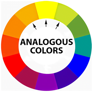
- Analogous — Colors next to each other on the color wheel have harmonious relationships and they usually have common emotional connotations.
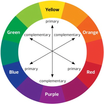
- Complimentary — On the color wheel, color complements are colors that are exactly opposite each other. Complementary colors are great for making vivid, stimulating graphics, but since they’re so popular, be wary of copying another company.
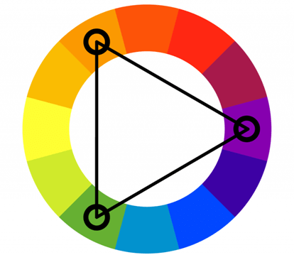
- Triadic — Triadic colors are a stable branding color scheme that divides the color wheel into three equal sections. Triadic schemes are as stable as analogous themes.
Your brand color scheme influences the style of your website, branding, retail decor, advertising, and even small details such as your social media account. As a result, choose them all carefully.

- Stick to 2 Colors Only
Another style principle is to make two colors rule the infographic’s shade scheme. The number of shades in your infographics can be reduced to make them sound more coherent. Choose two primary colors and use the others as accents if the paint scheme has more than two colors.
Color Theory Impact on Social Media
- We all have at least a hazy sense of what pictures look “good,” even though we don’t always understand why. When you apply color theory to your social media imagery and graphics, you’ll begin to understand the science and art behind it, and you’ll be able to produce pictures that convey a cohesive brand message and encourage your followers to take action.
- Take an effort to create photographs that use these colors in every way. Contrast is created by using complementary colors, which can be used to draw the eye to a focal point. Conversion ratios have also been found to be influenced by image contrast.
- Remember the target demographic and how their cultural context influences color preferences. White, for example, is frequently associated with beauty and sophistication in Western cultures, but it is associated with death and poor luck in some Asian cultures.
- Incorporating color theory into your social media marketing images will assist in the creation of a coherent brand identity that attracts your fans.
- Consider complementary and similar colors, the brand’s color scheme, comparison, how colors evoke feelings, and the distinctions between printed and digital media when creating photographs that can last with the viewers even after they’ve signed off.
Final Words
- Research color psychology: Color can elicit an emotional reaction from your infographic. The key is to use the right colors to elicit the desired response.
- Figure out how to choose a color scheme: There are a variety of online options available to assist you in selecting a color scheme from a variety of reference pictures or from scratch.
Adhere to a basic design principle: Set the color scheme up for success by adhering to good design standards before using it.