


In this article, I’ll go through the fundamentals of landing pages. What they are, why they’re important, and how a landing page may help your site convert more visitors. When you click on an advertisement, you may be sent to a landing page. It can also be the page that appears after clicking on a call-to-action button or the main page of a website. The goal of a landing page, regardless of how you “land,” is to persuade you to convert into a lead or customer. As a result, landing pages are extremely effective components of a company’s digital marketing strategy.
Table of Contents
ToggleWhat Is a Landing Page?
A landing page is any web page that a customer may arrive on, but in marketing, it’s generally a standalone page that serves a specific and focused function, apart from your homepage or any other page. A landing page serves as a follow-up to any promises made in your content. It’s essentially the next step in the process of a visitor becoming a customer. In exchange for supplying contact information, your landing page allows you to make a trade, a special offer, a piece of information, or a bargain.
Landing pages can be click-through sites that lead to other sites, such as your e-commerce site, or they can be lead generating pages. In exchange for submitting contact information, lead generating landing sites usually provide an eBook, a free trial, a contest entry, or a webinar registration. A strong landing page will do its job by persuading a potential consumer that providing personal information in exchange for anything you have to offer is worthwhile. Landing pages may be accessed via a general search or through your company’s website, boosting the chances of a potential consumer landing there.
There’s no need to limit yourself to just one landing page, or even one landing page at a time. Experts in marketing will likely advise you to keep numerous landing pages, each aimed at a different part of your client base.
Why do you need a landing page?
Why would you make a website just for visitors to fill out a form? Why not use your homepage or about page instead? Excellent inquiries.
You’ll probably be able to answer those questions after reading this chapter, but the quick answer is, by eliminating navigation, competing links, and other alternatives from a landing page, you may grab your visitor’s full focus. And having your visitor’s full attention allows you to direct them to where you want them to go, which is to your lead form. To summarize, landing pages are created with the goal of generating conversions.
Now that you know how important they are, let’s look at some landing page best practices to ensure your sites are optimized for conversion.
Difference between Landing Page and Webpage?
Why Do Landing Pages Convert So Well?
Landing pages are excellent for improving conversions for two reasons:
- They have a clear call to action.
- They’re aimed towards a certain demographic.
Landing pages, as previously said, outperform conventional pages since they are entirely focused on a single call to action. But it isn’t the only reason why landing pages are so effective.
Types of Landing Page
Let’s look at the two primary sorts of landing pages now that you know what they are.
- Lead generation landing page: This mini-site collects information about your target demographic in order to create leads. It usually contains a form where visitors can input their contact information so you can follow up with them through email and keep the conversation going. Offer an incentive, such as a coupon code, e-book, or webinar, or special material through email, to entice people to input their information.
- Click-through landing page: Users are directed to a sales or subscription page via this sort of landing page. It usually contains a CTA that directs users to the checkout process, encouraging them to buy or subscribe.
- Sales Page: The most challenging to design is frequently a sales page. You no longer just look for guidelines using this page. You’ll utilise it down at the bottom of the funnel, and it’s got to encourage them to buy, which is a very different offer to a simple request and reward combo. The construction of the page involves a feeling of delicacy and a full grasp of your clients’ demands and location on your sales route, from the copy to the design.At this moment you may either sell too hard and turn your customer away, or you may undersell and lose the transaction regardless. Good old-fashioned sales must be included into your design and communication techniques.
- Infomercial: You may believe that infomercials are a remnant of late-night television advertising in the 1990s, but many firms effectively adapt their sales methods into their digital campaigns, particularly in the form of specific landing pages. In contrast to squeeze or lead-generation pages, which are defined by their shortness, infomercials give your viewers a long, complex tale, employing text that resembles those late-night sales gurus’ emotional and exuberant characteristics. The goal is to keep readers scrolling and persuade them to buy something.
- Splash Page: Splash pages are the most important type of the landing page and may be used in your sales funnel at any time. They often include a very low level of material, a huge one or two photos, and very basic information such as a message or a simple ‘yes’ or ‘no.’ You may ask your reader to check your age or to choose their preferred language before you visit your website. They are not intended to collect data or to develop leads, but merely provide consumers with essential information before reaching your website.
- Viral Landing Pages: The primary goal of viral landing pages is to raise brand exposure. While they almost always include links to a company’s website or other web pages, they are generally provided in a subtle and inconspicuous manner. The most essential aspects here are the content that should be instructive and /or interesting enough to inspire a reader to share the site and the ability to share the site via the social media. Written copy, as well as videos, pictures, and even games, might be included in the material.
- Microsites: A microsite is a dedicated, tiny website, as the name implies. It’s made for a certain campaign or to achieve a certain sales objective. Although it is more than a single page, it is nevertheless referred to as a landing page since it is dedicated to a particular component of sales and promotional activities. Microsites are frequently triggered by internet advertisements or used in conjunction with television commercials.
When to use a landing page
Whatever your objectives are, there are a few methods to reach them with the help of a landing page. Here are some of the scenarios in which a landing page might be useful.
- Directing users to your product: You may drive people to your product purchase page or eCommerce site by establishing a landing page with an actionable CTA, such as “Buy Now.”
- Offering a free trial: Use a landing page to get people to sign up for a free trial if you provide a subscription service.
- Capturing leads from a blog post: Incentivize your blog visitors to provide their contact information in return for additional in-depth material, such as a free e-book or whitepaper.
- Obtaining newsletter subscribers: To entice people to join up for your email newsletter, create a landing page.
- Getting event registrations: A landing page that entices users to register for an event, such as a webinar or online course, can help you capture more leads.
- Creating user memberships: Use a landing page to get visitors to join up for a premium membership that offers them VIP benefits such as access to special material or invitations to events reserved for members only.
Now that we have the basics out of the way, it’s time to dive deeper into the exact types of landing pages that work best.
How to Create Landing Pages Templates

Craft a benefit-focused headline.
At least seven visitors will bounce off the website for every 10 people that view your landing page. To keep this number low, in seconds of your arrival, your visitors have to know (and comprehend) what they are talking about. You’ll read your headline first and should explain the value of your landing page and offer simply and concisely.
Select a picture that shows the offer
Yes, an image is necessary, and your target audience should be represented. Your image has the goal of transmitting an emotion – it ought to represent how you feel when you get your proposal. Some photos may work better than others, therefore you always have to split tests (which we will discuss later).
Write an attractive copy
Don’t spend all this time preparing the perfect headline and generating a flawless image of your words that really will sell your call to action. Your text must be clear, succinct, and guide your visitor in what you want it to do. A compelling text also communicates to visitors directly with the words “you” and “your.” We will continue further on the following copy tips.
Enter the lead shape above the plug
If your prospect wants to convert immediately – you absolutely do not want it to hunt and study your landing page to locate your offer, your lead form must be readily available. “Follow up the fold” implies that visitors don’t need to scroll in the form, as soon as someone hits the website. This may be an anchor or a form link. Even better: Design your form to scroll down the page with the user.
Add a clear and impressive call for action
Probably the most essential feature on your landing page is the call-to-action (CTA) – it is one of several components that promote transition. You should highlight CTA and choose a color that compares with other components on the website. The button must stand out. You know what visitors want you to do, that is to use the action verb to describe them, such as “submit” or “download” or “get it now.” More about best practices for CTA below.
Give away a relevant offer
Consider your landing page as part of your final journey — your product or service. Your offer is what you provide for the personal information of your company. It should not just be appealing enough to offer your visitor with their contact information, it should be important for your company. Say that you are selling horseshoes.
Your offer might be “10 easy ways to size your horseshoes” because you’ll ultimately be asking to buy your horseshoes. You wouldn’t make them an offer on organic agriculture since it puts them on a whole new road. We will discuss how intriguing the following offers are.
Only ask for what you need
But how much you ask for relies on a number of factors: the familiarity they get with you, the locus of their purchaser and the level of trust they have in them. Request as little information as you need to establish a low entrance barrier in your lead form. A name and an email is more than enough to promote a new direction.
Remove all navigation
The only goal and purpose of your landing page is to make the visitor a guide. Any competing link – even internal connections to other websites on your website – distracts you from that objective. Remove any additional links on your page to attract the attention of your visitors.
Make your page responsive
Like every page on your website, your landing pages must adapt to every visual experience. The last thing you need is to leave your form on mobile devices unreadable. Give your visitors every chance to convert, regardless of how they view your website.
To do this, you can utilize tools.
Optimize for search
Of course, via email blasts, social postings and other marketing tactics, you will be driving people to your homepage, but the target keywords for your sponsored ads or organic search should also be added for your website. You should locate your landing page when someone looks for your keyword. Likewise, these terms should be seen on your landing page when you target a keyword with paying advertisements.
The Ultimate Guide to Keywords Optimization: Read Here
Remember to use a thank you page.
You’ll send leads to a Thank You page once your form has been completed. You may present simply a thank you on the same page, or say thank you, but it is not the greatest option, for several reasons.
A thank you page serves three important purposes:
- The offer you have promised is delivered (typically as an instant download)
- It is an opportunity to thank you for your interest in recommending you to a customer in the queue.
How to Design Your Landing Page
Design often signifies creativity, colors and beautiful images. We take a further step towards a functional, helpful, and effective design for the purposes of a landing page. So you must access your right and left brain to build a well-designed landing page. But don’t get me wrong – you’ve got to convert your visitors with amazing graphics and beautiful colors. We will discuss how all this may be included below.
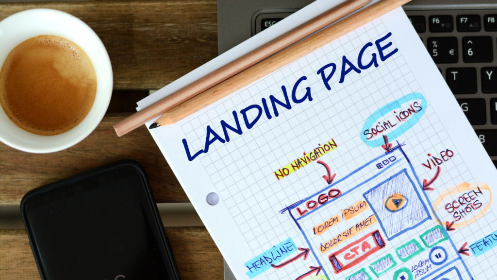
Landing Page Structure
The good news is you don’t need to get too creative here. Most of the landing pages are structured in a fairly similar way as it is proved. With branded components and pictures you may infuse your originality, yet adhere to the landing-page formats that consumers usually look at.
A decent landing page includes five parts (see example of the landing page below for practice of these elements):
- A headline that grabs the visitors attention
- Relevant image that is relevant to your audience
- Lead form that sits above the fold to capture visitors’ information
- CTA that is action-oriented and compelling
- Copy and description that informs and entices your visitor to complete your form
Can more be added to your landing page? Absolutely. (Please utilize social sharing buttons to spread your offer news). That’s just the minimum. You need to know your audience from where they are and where they come from, and how much you must include in your purchaser’s trip. The rule is to offer as much information as you need to convert individuals.
Landing Page Layout
This may come as a surprising revelation, but most consumers are not reading every word of your smart content. The most significant pieces are instead skimmed through and drawn out. The objective is to make your visitor stand out so that nothing vital is missing.
That means a few things …
- Keep the most crucial content over the fold to avoid scrolling your visitor to reach the fold.
- Take a blink test on the website, implying that you can collect the message fewer than five seconds before you blink.
- Use white (or negative) space to engage, concentrate and assist your visitors understand your message.
- Write using short paragraphs and bullets to help you consume your text easily.
- Try to create an important F-pattern copy, in which the majority of people skim a page online. Work with visual models to lead them to the essential points to convert them.
Landing Page Colors
You should reflect the style of your landing page, including the colors you utilize. This implies that they need to familiarize themselves with your branded colors and uniquely style with the individuals that visit the landing page. The more your brand recognizes, the more you trust (and the more they trust you, the easier it is to get them to do what you want them to do).
The locations where alternative colors are to be used are on the parts of your website that need to be highlighted – ahem, the CTA button. The name of the game here is Contrast. Tell your branding colors are green primarily… A color which can grab consumers’ attention, say purple, you wish to pick.
Which colors do you wonder? We have done a little study to find out what colors best convert.
Landing Page Images
One of the first things visitors see is the picture on your landing page. Since images are processed far sooner than words, this sets the tone for the whole experience. But how can you pick between millions of stock images that use all the space on your computer and that corporate photo shoot?
Let’s narrow down the selection with a few important questions:
Who is my target audience?
What does it look like for your person? They’re how old? How do they dress? How do they dress? What do they care about? These questions will be answered crucial to choose the picture that you will put in front of the landing page. If you want your audience to be attracted, you must somehow portray them.
Where do I want people to look at my landing page?
This may sound like a strange question, but it is really founded on the thought that individuals follow directional indications, such as where others gaze or point. If you wish to fill out a form, pick a picture that focuses your attention on this form.
Will this image reinforce my message?
An vital purpose is to each piece of your landing page. Because your picture is one of the first things you see, you should define what visitors may anticipate of your page. Ensure you offer value to your image.
Some more significant things to consider while developing amazing graphics of the landing page.
Call-to-Action (CTA)
We have mentioned your CTA so far a few times, but it is worth noting again since it is the most significant aspect of your landing. When designing your CTA, it’s so attractive that the visitors are forced to click on a few tactics. In order to make it clear, your CTA has the button and content used to grab your attention.
- Give the dynamic contrasting hue of your CTA
- Concentrate your copy on your visitor’s advantage
- Get to the point – aim to use only five words
- Size your button to stand on the page
- Give it some negative space — don’t crowd the area around your CTA
- Follow the page flow and put your CTA, for example on or under the copy, where the reader’s eyes go
- Test the form of the button, test the copy… All in fact tests (we will discuss how to accomplish this below)
Mobile Landing Page
More than half the website traffic comes from mobile devices, thus, no matter what device visitors use, their user experience should be the same. You will offer them every chance to see and convert, on desktop, phone, tablet, or otherwise, by making responsive landing page or Web page.
Landing Page Copywriting Tips
Great copy comes after design. Your goal is to be at once captivating, informed, loving, succinct, effective, confident and informative. How? Continue to read.
Cover the main points.
Regardless of how you place it, you must strike with your content copywriting on a few major areas. Those are the key points of pain for your individual, the solution to that suffering, how you operate (features), how you enhance your solution (benefits) and how it works (social proof).
Most of what you write has to do with how you can help your prospect, not just how wonderful you are. Let we delve into these matters more deeply.
The Pain Point
You should focus on the pain that solves your offer. It doesn’t sound negative. However, it is vital that you touch your person’s problem so that they realise what is going on. Empathy is a good approach to create confidence. And they are more inclined to believe your solution if they know you have your problem..
Your Solution
The remedy to your problem is what you provide for your information. Explain a clear route from your problem to the answer they require.
Benefits
Your text should be loaded with advantages for the user since they are truly interested in it—what it contains for them. Allowance tells visitors how their position is improved as features detail what your offer provides. It shows how much better their lives can be by adopting your solution.
Social Proof
Studies indicate that social evidence is efficient in convincing individuals to act. Social evidence is provided in the form of brand logos with which you work, statements from past customers, product evaluations or confirmation that other people have purchased your service. Essentially, consumers want to hear that others have utilized your solution and have profited from it too. You validate your product without saying anything by providing social evidence on your landing page.
Use click triggers.
The triggers are developed before a visitor converts to eliminate the final piece of doubt. You can see them as lick enhancers of probability (… yes, I made up that term). They are essentially placed next to your CTA which pushes your perspective over the brink by ease of mind and reduce the risk of conversion
Below are several efficient techniques to use triggers for clicking:
- Money-back guarantee
- Easy unsubscribe
- Blurb on “what to expect”
- Price slashing
- Privacy policy
- Some other creative method
How to A/B Test Landing pages
A/B Testing Your Landing Page
All we have spoken about till this is excellent… in theory. But you have a distinct business than others and your target demographic is unique. How do you know whether the copy that you picked works? Or whether it’s okay to position your CTA? Or what are the best colours? Or what picture to select?
You test it. You test it. It’s like that. Split tests (or A/B tests) are no news for you as a marketer, and dividing your landing page into tests is just another experiment to add to the roster.
Let us examine quickly how best to test your landing pages A/B.
What is A/B testing?
A/B testing simply divides your visitors into two (or more) page versions to discover what works most effectively. Whilst one variant may be initiated manually for a period, and another one for the same time period, the usage of a program that lets you divide tests and follow your findings is far more efficient.
The key components for the A/B test are the variations, or two copies of the page, the champion, or the original page, and the challenger.
How to A/B Test
The most essential way to divide the tests with each experiment is to make extremely modest adjustments. For instance, because you do not know which element the results were achieved, you do not want to test your headline and your image simultaneously. This is why one element should be tested at a time. You may create a new challenger to test the next aspect, and the “winner” becomes your champion. You repeat this cycle until you get a rate of conversion with which you are pleased (and which is a realistic expectation we will discuss later).
What should you test?
On your landing page, you may test practically anything. However, although this is feasible, your test may be restricted to some of the most impacting parts of your site, such as:
- Headline copy
- Image
- CTA color
- Click triggers
- Copy on the page
- Lead form length and fields
The most significant impact of these testing is on your conversion rates. First try to modify your method to bigger companies such as a headline or CTA, such a copy of your page.
Landing Page Metrics to Track
Metrics will inform you how well your landing page is doing, and will offer you an insight into how it may be improved. When you start a page, it’s difficult to determine exactly what will work. Measure and track your metrics rigorously in the beginning until you get a pretty good conversion rate.
Page Visits
How often do you visit your landing page? The more trips you make, the more likely you are to change. Try to adapt your sponsored approach to make more visitors onto your page or to redefine your keywords. By email, social media and on your website, you may also inform your current fans about your offer.
Submission Rate
This is the amount of individuals on the thank you page that complete your lead form. There are a lot of adjustments that you can apply to your page in order to boost these numbers.
Contacts
Contacts refer to your form for the number of leads you have produced. This is because duplicate contacts are tallied just once, therefore if a current lead completes your form to obtain your offer, they do not effect the number.
Heat Mapping
This is more about how people, in contrast to the statistic, engage with your page. Heat mapping can indicate where visitors are scrolling, reading and how they are interacting with your website. All of these are useful information for the design and structure of your page.
Bounce Rate
If you visit your website and leave right away, you have to check if the content is matched with the offer. Does your copy catch the visitor’s attention and know what to do when they get on your page automatically? Is the copy you utilized to get visitors visit your page?
Form Abandonment
This measure informs you how many individuals fill in but don’t complete your application form. If this number is exceptionally high, certain changes will introduce additional click triggers, shorten your form, or make clearer what your visitor would want to accomplish.
Benchmarks
To see whether the landing page is functioning as intended, you have to assess industry standards and a similar audience. Take a look at some industry standards, but don’t be disheartened by the performance of the other firm.
Whatever happens, if you pay careful attention to your stats, you can diagnose and cure your landing pages.
5 Examples of Landing Pages That Convert Users
Attractive typologies, strategic white spaces, motivational colors, and CTAs, are all designed for maximum effect on the landing pages with highest conversion rates. See the greatest things in the field.
- Emotional Images
Some pictures are merely practical while some punch emotionally. The landing pages focus your attention on gadgets with repetitive color differentiation and strong backdrop color. If you start the emotion you want, and have a wonderful product, you can accomplish more with less.
- Appealing Typography
By mastering the art of typography, even a modest family firm may become a significant web player. Busy Beaver Button Co. illustrates how many distinct font and style options coexist without disturbing on a small landing page.
- Strategic White Spaces
White space may make all the difference in the world, or gradient space in this case. The landing page shows how to remove the problems of international transportation with a simple line of white text, two CTA buttons, and a thumbnail. It is not just transportable, but it is as easy as the promise of the product.
- Motivational Colors
A lot is happening on landing page, a website for monetary presents. This landing page delivers a fundamental notion in a powerful, primary visual of a rocket surrounded by color-coded gifts, rather than boring the reader with minutiae. The colors are soft enough not to distract from CTA, yet lively enough to capture the attention of the viewer and distinguish him from the audience. There is something for everyone here in the spectrum of hues.
Use the Best Tools for Prototyping and Design
At the constructing landing pages, you don’t need to reinvent the wheel. The greatest prototype and design tools on the market provide you with the basic structure for your landing page and lead your team to a clear vision of the objective.
FINAL WORDS
Landing pages are a strong tool for driving your business with qualified customers when you have the appropriate plan and resources to efficiently carry them out. Look closely at where you already have your online business and see where your firm may profit by using optimized landing pages and the complete leadership approach.
Focus on how you can synchronize your landing pages with email marketing and other internet channels, as well as your organizational objectives. Finally, define methods that your team will use for the set-up, optimization, and timely publication of your landing pages utilizing the proper tools, talent, and strategy for your business.
Please email us at digipranavjha@ gmail.com if you want to rate your firm. We are here to assist you in ranking your company and developing a brand. Our SEO professionals have extensive experience converting your online business into lead generating solutions. White hat tactics used by AP Web World (Managed by Pranav Jha Team) have a long track record of success, resulting in top SERP results for clients all around the world